PROJECT OVERVIEW
In my role as a UI designer, I was responsible for creating the UI for a new responsive banking application.
Our client was a challenger brand looking to make waves in the financial world. They’re not afraid to add more personality into their UI than the well-known, established banks while keeping things intuitive.
The design needed to work responsively across desktop, tablet and mobile layouts.
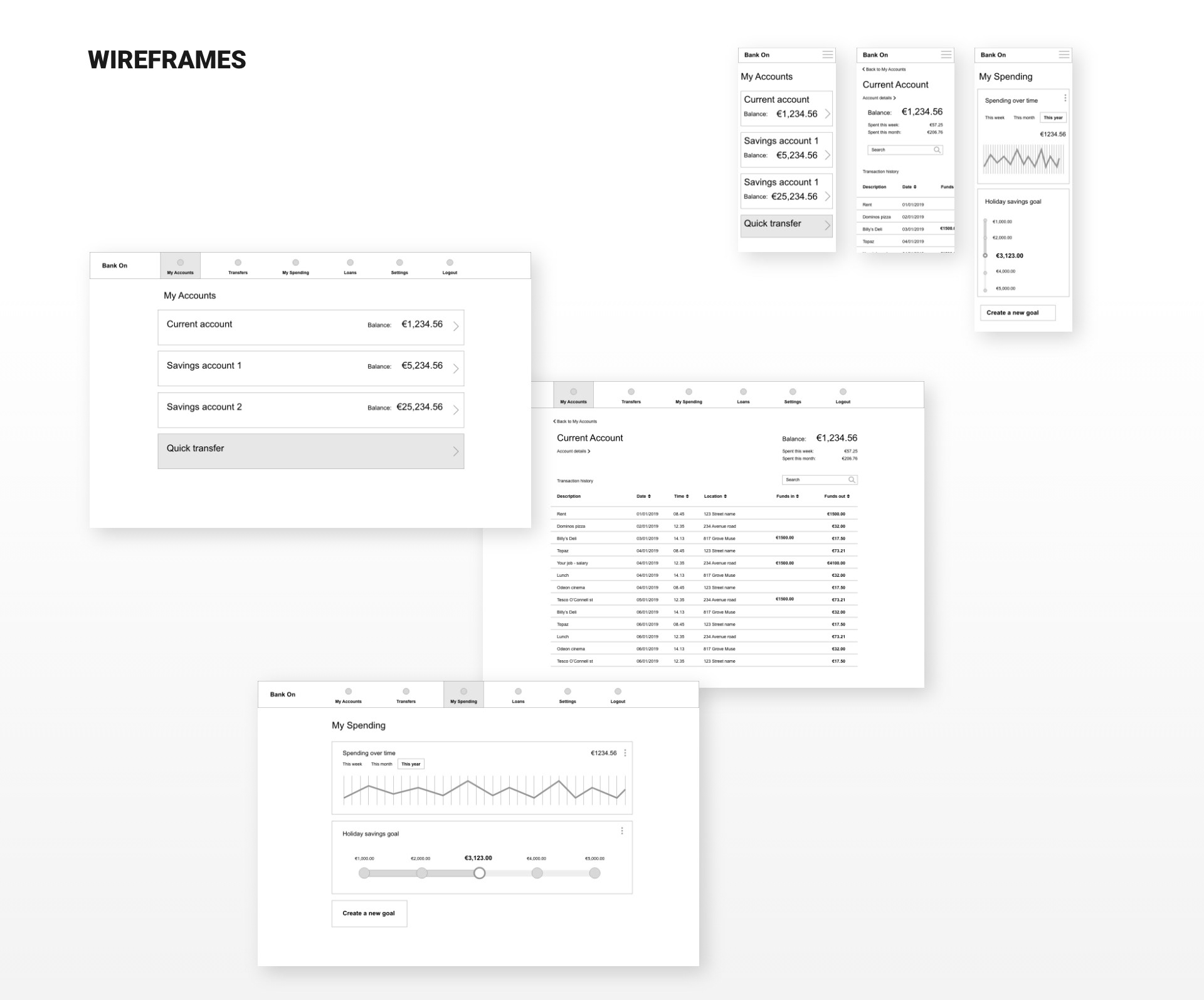
Wireframes provided by the UX team served as the foundation for our work.
ROLE
UI Designer
MAIN TASK
· Branding for the bank.
· Create a fresh new interface for a responsive banking application.
Something familiar to use, but also more playful than established banks.
Something familiar to use, but also more playful than established banks.
· Design polished user interfaces desktop, tablet and mobile screen sizes
BRAND TONE
The client established brand principles in place. Their tone and personality are as follows:
Playful: Using our product should be a joy for users. We’re not afraid to add some extra personality into our style like colour, animation and shape, but not at the cost of being intuitive.
Clear: We’re dealing with people’s money, so we need to make sure to present their information in a clear and uncluttered way. White space is our friend.
Trustworthy: Our product must convey a sense of trustworthiness in presentation.
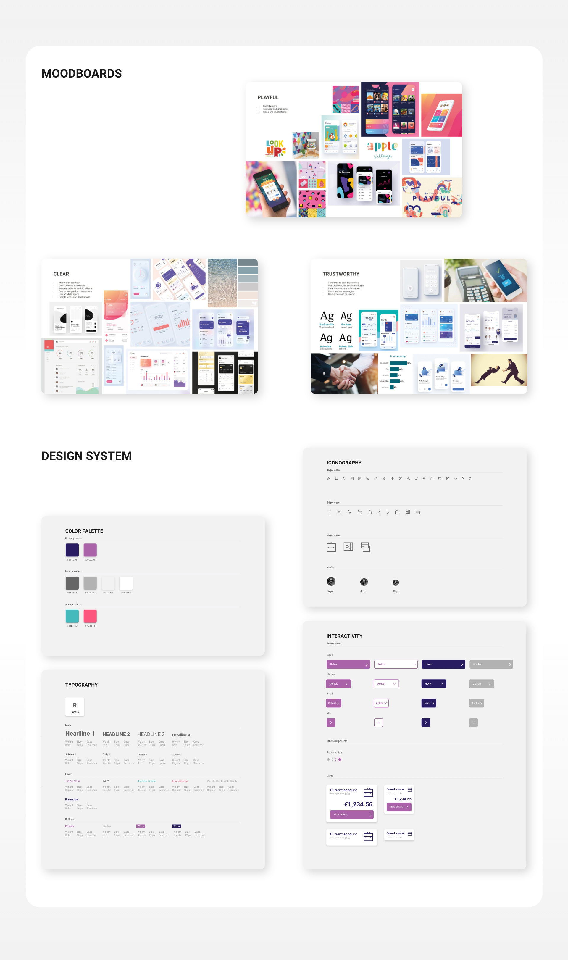
MOODBOARD
The first step involved researching competitors and drawing inspiration from the market. I collected references on how to incorporate brand tone, typography, and layout into the screens. As the project is constantly evolving, I continuously developed the mood board throughout the design process.
COLOR PALETTE & TYPOGRAPHY
After creating the moodboards, I conducted research to establish a color palette including primary, secondary, and background colors. Following this, I selected a font for our UI and developed a typographic scale, considering factors such as line length, line height, type size, and type hierarchy to enhance the presentation of content.
ICONOGRAPHY & INTERACTIVE STATES
I gathered examples of UI elements with various interactive states and searched for form fields, buttons, tables, and menus that align with the brand. I then added them to our mood board, along with icons reflecting the bank’s style.
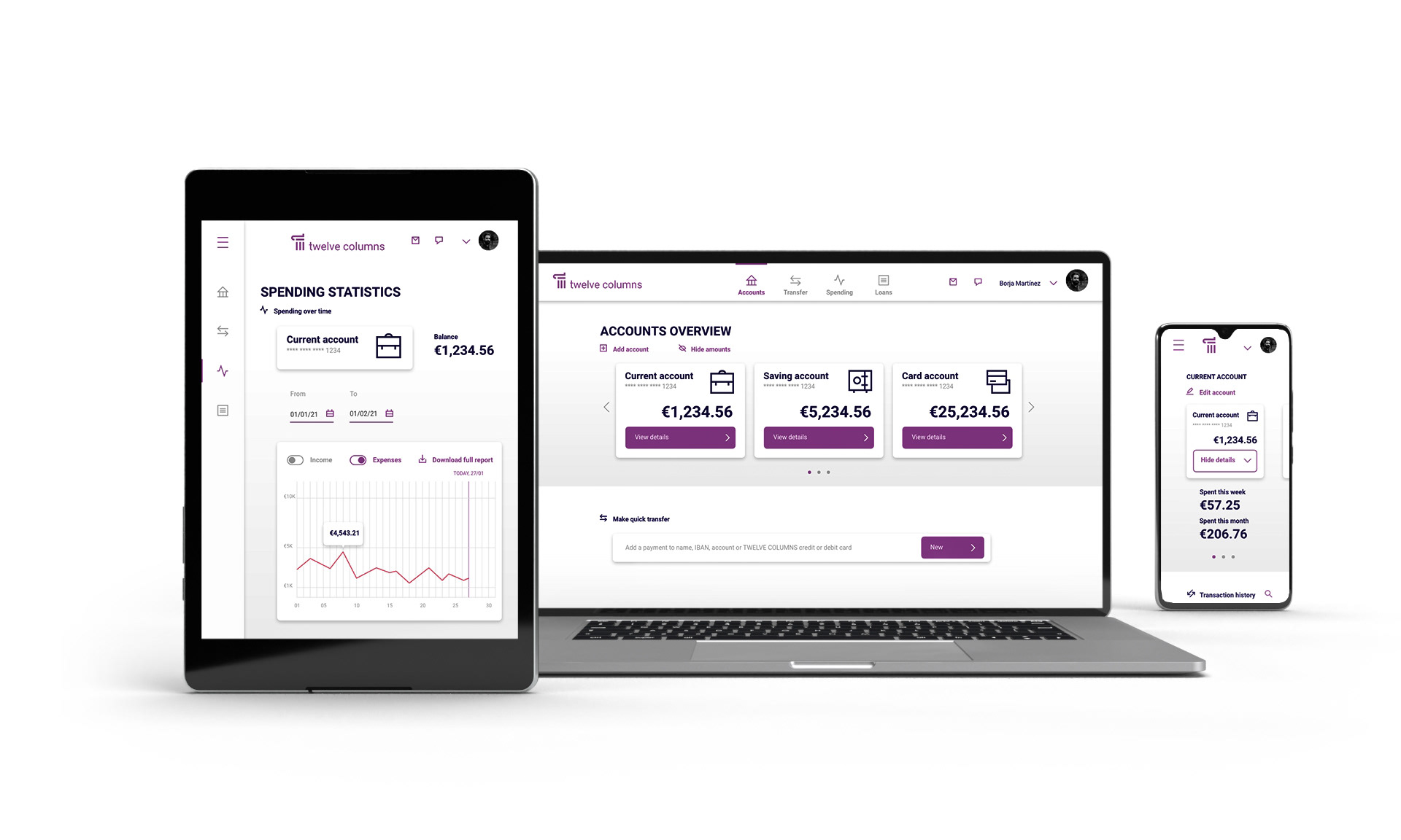
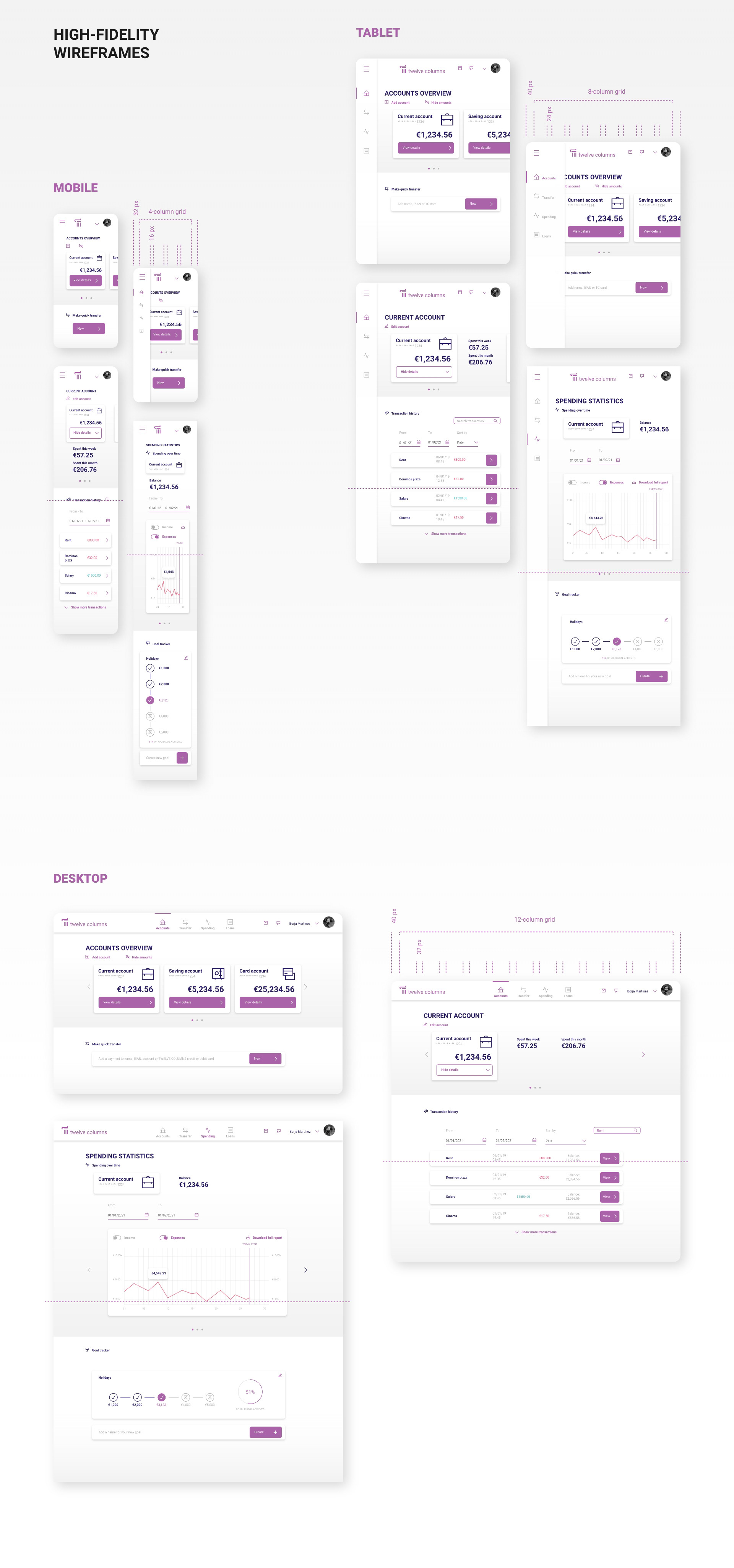
FINAL SCREENS
Based on an 8pt grid, I established underlying grids for the desktop, tablet, and mobile screens. This includes a 12-column grid for desktop, an 8-column grid for tablet, and a 4-column grid for mobile.
FINAL REFLECTION
Reflecting on the final result of my work, I want to emphasize that the minimalist and clean aesthetic aligns well with the brand tone. Working with the established brand principles, such as “playful,” “clear,” and “trustworthy,” was valuable in achieving the desired aesthetic.
Gathering all this preliminary information and organizing it into mood boards made it easier to define design rules and incorporate feedback.
Upon reviewing the final result, I would reconsider certain aspects, such as the typographic hierarchy and its application, to provide the project with better structure and readability.
Furthermore, I am interested in developing a set of illustrations to further explore the playful aspect of the project brief. I aim to integrate these illustrations into a banking environment and assess their impact on the overall design. Additionally, I plan to explore the interactivity aspect and consider adding some animations.
In closing, working on a project based on UX design was a great experience that brought me a coherent, established work methodology and allowed me to focus on visual aspects to give the project personality.